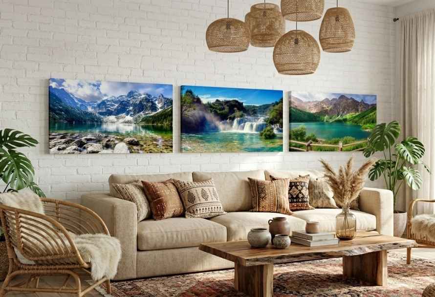
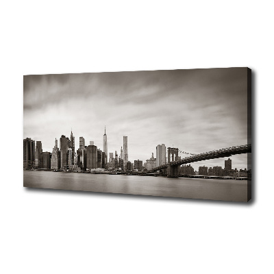
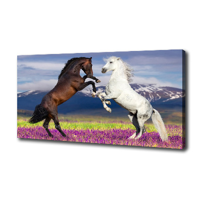
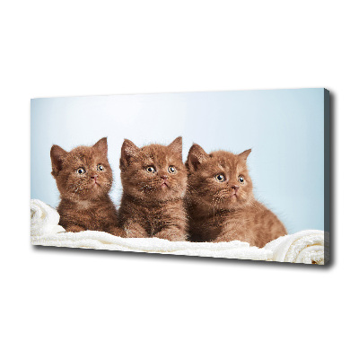
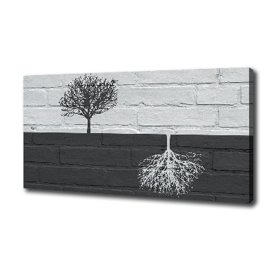
A wall gallery in the living room is one of the most interesting ways to give the interior an individual character and create a decoration that immediately catches the eye. A well-planned gallery can tell the story of the household members, recall inspirations from travels, highlight passions, and even visually organize the space. On one wall you can have paintings, photographs, drawings, quotes, graphics, posters in various styles, as well as mirrors or other decorative elements. The key, however, is consistency – that’s what makes mixing motifs look deliberate rather than accidental.
Many people wonder how to create a wall gallery so that the whole does not give the impression of chaos. The good news is that a gallery does not have to be perfectly symmetrical to look harmonious. What matters more is the effect you want to achieve and how you match individual elements to the character of the room. In this guide, we’ll show how to create an interesting composition, choose the right wall, plan the layout without unnecessary drilling, and combine paintings, frames, and photos into a coherent, eye-pleasing whole.
Wall gallery in the living room – where to start planning the composition?
Before the first frame hangs on the wall, start with the most important question: what effect do you want to achieve? This decision should determine the choice of artworks, color palette, frames, sizes, and the place where the gallery will appear. A calm, elegant decoration above the sofa will look different from a family photo gallery, and different again from a dynamic set of posters, graphics, and photographs inspired by travel.
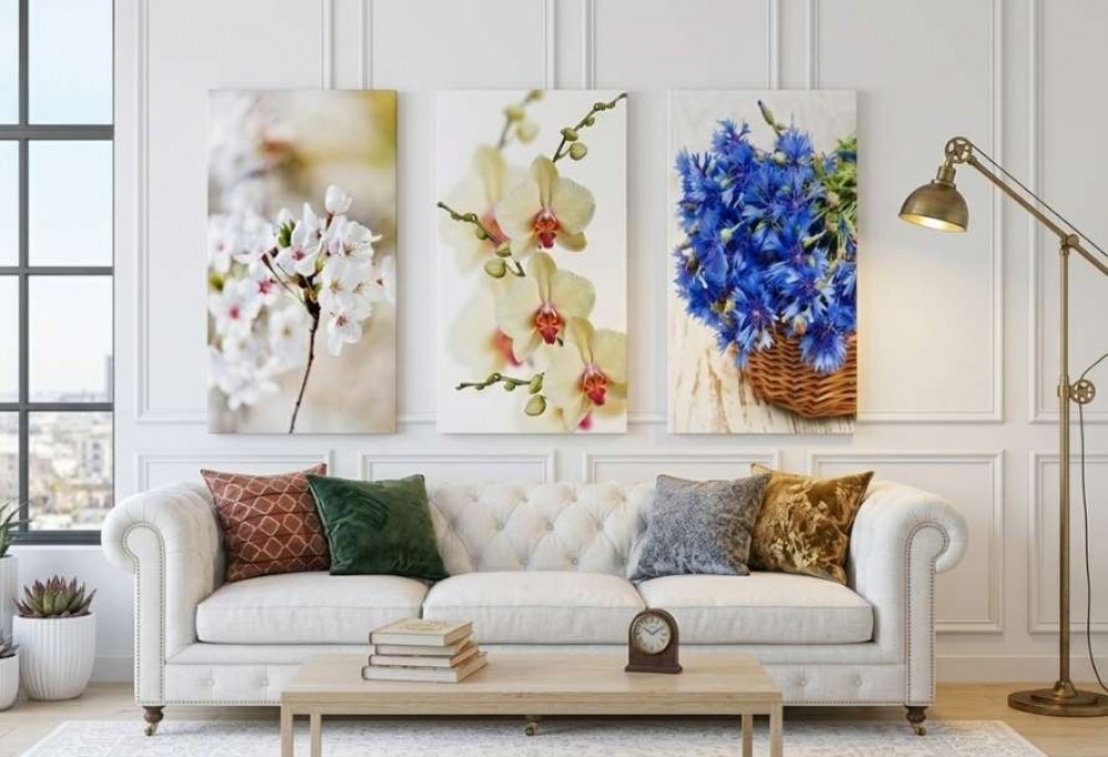
It’s best to choose a suitable wall that naturally draws attention. In the living room, the ideal spot is often the space above the sofa, sideboard, table, or console. The gallery can also look great on an empty wall leading to the kitchen, in a relaxation corner, or in the passage between the living room and the dining room. Similar rules work well in the bedroom too, for example above the bed, where a well-chosen composition can add depth, elegance, and coziness to the interior.
When planning, remember the proportions. The size of the wall gallery should match the piece of furniture over which it hangs. If the decoration is to be placed above the sofa, it should be neither too small nor overwhelmingly large. Usually, a layout whose width occupies a significant part of the sofa’s width but does not extend beyond its outline looks good. Thanks to this, the whole feels well thought-out and anchored in the space.
A simple sheet of paper, painter’s tape, or laying all the artworks out on the floor is very helpful. Such a trial layout lets you check whether the composition looks light, whether the spacing is even, and whether the center of the composition is in the right place. This is a good moment to move paintings, swap frames, change portraits from vertical to horizontal, or add a passe-partout that will visually calm stronger graphics.
When planning, also take care of the hanging height. Most often, pictures should hang so that their central part is roughly at eye level. If the gallery is above the sofa, leave enough space between the furniture and the bottom line of the artworks so that the decoration doesn’t look like it’s been randomly “stuck” to the top of the wall. When hanging pictures, a spirit level, tape measure, and gentle marking of the mounting points will come in handy. This will help you avoid unnecessary drilling and make it easier to achieve a harmonious effect.
At this stage, you don’t yet have to buy everything in the store or decide on the final number of elements. Start with a general concept: choose the place, define the character of the gallery, plan the layout, and check which paintings, photographs, quotes, or drawings best suit your interior. A well-prepared plan is the key to creating a gallery that will be not only a trendy decoration but also a personal story embedded in the living room.
A common theme – the secret of a coherent picture gallery
The biggest challenge in creating a wall gallery is not the hanging itself, but finding an element that will connect different motifs into a harmonious set. It is the common theme that makes the gallery start to form a single story. It’s not about making all the works look identical. On the contrary – variety can give the arrangement an individual character, provided that the whole has a well-thought-out coherence.
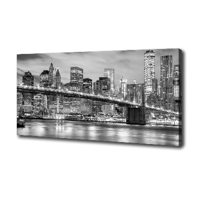
The simplest way to organize a composition is to choose a common color. It can be a shade that appears in several graphics, the color of the frame, the hue of the passe-partout, or a tone referencing the accessories in the living room. If the room is dominated by beiges, wood, white, and natural fabrics, boho-style paintings, delicate nature photographs, botanical drawings, or graphics in warm, earthy colors will work great. In a modern interior, black and white photos, minimalist posters, and simple frames can look good, introducing a sense of elegance and order.
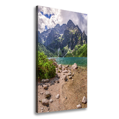
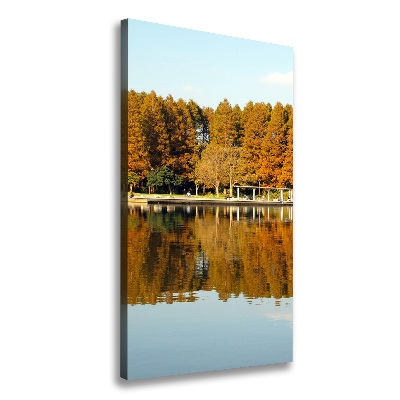
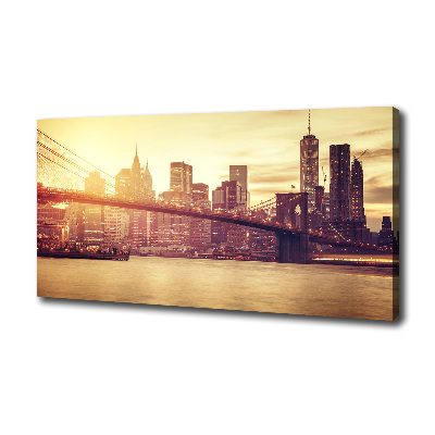
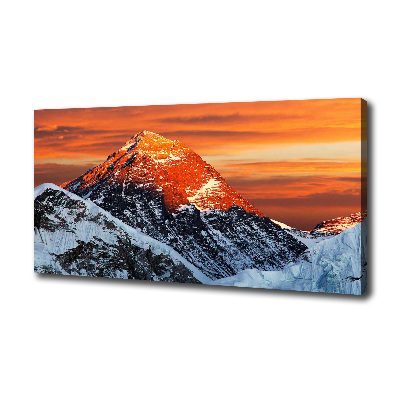
The second solution is to link the works by theme. The gallery can tell the story of travels, show favorite cities, landscapes, family moments, or abstract inspirations. In such a layout, different sizes and formats are not a problem, because the common idea leads the eye across the entire wall.
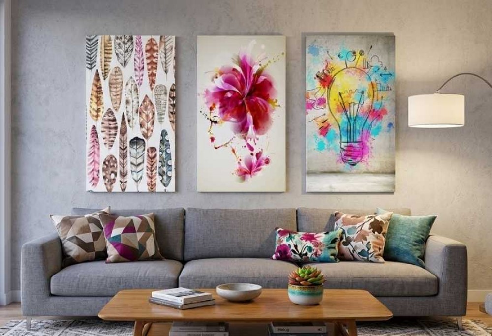
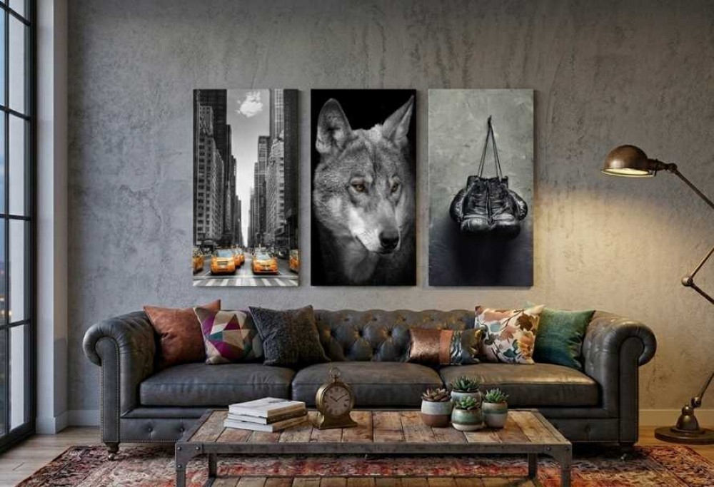
Coherence can also be built using frames. If the motifs are very different, similar frames can calm the whole and give it an elegant rhythm. Black frames will add expressiveness, wooden ones will warm up the interior, and white ones will make the composition lighter. This doesn’t mean that all frames have to be the same. Interesting effects can be achieved by mixing widths, textures, and shades, but it’s best to do it consciously – for example, by choosing two dominant frame colors instead of five completely random ones.
In a wall gallery, it is also worth paying attention to the mood of the artworks. Even if you combine landscapes, abstractions, and photographs, try to make sure they have a similar energy. Delicate, pastel graphics may look bad next to very intense, contrasting posters if there is no linking element between them. On the other hand, you can repeat a strong color from one picture as a smaller accent in another, giving the layout balance. This is a simple trick that lets you create a wall gallery full of life, yet still orderly.
Remember that a wall gallery in the living room doesn’t have to look like a ready-made set from a store. The most beautiful compositions are often created from various elements collected over the years. The common theme works like an invisible thread – it binds these works together and gives the wall a personal, harmonious character.
How to combine paintings with different motifs and avoid chaos?
Combining paintings with different motifs requires a good eye but doesn’t have to be difficult. The most important thing is to determine from the start where the center of the composition is and build the whole layout around it. It can be the largest painting, the most distinctive graphic, or a photograph that has special meaning. Such a focal point draws the eye and helps organize the remaining elements. Thanks to this, the gallery doesn’t visually fall apart into random decorations but forms an interesting composition.
A good method is the rule of balance. If a large, dark painting appears on one side of the gallery, it’s worth placing a few smaller works or a graphic with a similar visual impact on the other. Different sizes add dynamism, but they must be arranged so that the whole doesn’t seem to lean optically to one side. In practice, this means that it is not worth grouping all large paintings only on the left and all small ones only on the right. It’s better to arrange them so that the composition is light, stable, and pleasant to the eye.
The spacing between pictures matters a lot. Even the most beautiful photos, posters, and drawings can look chaotic if there is too little or too much free space between them. It’s best to keep equal spacing, especially when you want to achieve an elegant, orderly effect. In more relaxed arrangements, the gaps can differ slightly, but they should still look intentional. Before drilling, it’s worth laying out the arrangement on the floor or mapping it onto the wall using paper templates. This allows you to see the whole before the works go into their places.
It’s also worth watching out for too many strong accents. If a single gallery contains very colorful paintings, expressive quotes, mirrors, family photos, patterned frames, and contrasting posters, the interior may feel overloaded. This doesn’t mean you have to give up character. It’s enough to choose a few dominant elements and complement them with calmer works. A strong abstract piece can look great next to delicate photographs, and a bold poster will gain lightness if you pair it with simple drawings or graphics in a similar color palette.
Mixing styles works best when one of them leads:
For example, in a living room arranged in boho style, you can combine paintings with plant motifs, travel photos, ethnic graphics, wooden frames, and delicate mirrors.
In minimalist interiors, a smaller number of works, larger spacing, simple frames, and a limited color palette will work better.
In eclectic arrangements, you can allow yourself more freedom, but even then make sure there is a single common element: color, theme, format, or mood.
When planning, also pay attention to the direction of the layout:
The gallery can develop vertically if you want to visually heighten the room, or horizontally if the decoration is meant to emphasize the length of the wall above the sofa.
Above the sofa, a horizontal layout or a slightly extended rectangle that follows the line of the furniture usually looks best.
Above a sideboard, you can allow a more relaxed composition, while in a narrower space a vertical layout will work well. In every case, choose a rhythm that suits the space and does not disturb the room’s proportions.
Frames, formats, and sizes – details that organize a wall gallery
Frames are one of the most important elements that determine whether a gallery looks coherent, elegant, and deliberate. Even if paintings, photographs, posters, drawings, and quotes differ in motif, color, and style, properly chosen frames can combine them into a harmonious set. It is the frames that give the composition rhythm, organize the space, and ensure each piece has a clear place on the wall.
If you care about a calm, orderly effect, choose frames in one color. Black frames strongly emphasize the modern character of a gallery, white ones add lightness, and wooden ones warm up the interior and suit boho-style arrangements well. In a classic or glamour living room, you can opt for thin gold or metallic borders that bring a note of elegance into the space. Such a choice works particularly well when the wall gallery includes different motifs, because the shared framing becomes a visual connector.
This doesn’t mean, however, that all frames must be identical. You can create an interesting composition by consciously mixing frames. It’s worth limiting the number of colors and textures so that the whole doesn’t lose coherence. A good solution is to combine two types of frames, for example black and wooden, or white and gold. Thanks to this, the wall gallery in the living room gains an individual character while still looking harmonious.
Formats and different sizes of works are also very important. A gallery can consist of several paintings of the same size, which creates a very orderly, almost gallery-like effect. Such a layout works great above a sofa, sideboard, or in a long corridor. You can hang the works at equal distances, keeping one line at the top or bottom. A spirit level will be useful for this type of mounting, because even a slight deviation can disrupt the whole.
A more relaxed gallery is created when you combine different sizes and formats. One larger wall art can be the center of the composition, with several smaller graphics, photographs, or posters hanging around it. Such a layout gives the wall depth and natural dynamism. However, remember not to place elements randomly.
It’s also worth paying attention to the passe-partout, i.e. the light border inside the frame. This detail can do a lot: it adds lightness, highlights photos, calms intense graphics, and makes the whole decoration look more professional. The passe-partout works particularly well for photographs, minimalist drawings, and posters that need a bit of “breathing space”. If you combine many small elements in a single gallery, a passe-partout can help maintain visual order.
A picture gallery matched to the style of the living room
The gallery should match not only the chosen wall but also the entire interior. This is important because a decoration made of paintings, photos, and graphics doesn’t exist in isolation from furniture, colors, fabrics, lighting, or accessories. If you want to create a gallery that truly enriches the living room, start by observing the space. Pay attention to the wall color, floor tone, sofa style, type of lamps, curtains, rug, and decorative elements already present in the room.
In a modern living room, simple compositions, a limited color palette, and expressive yet restrained motifs work best. These can be black and white photographs, abstract graphics, typographic quotes, or minimalist posters in thin frames. Such a gallery does not overwhelm the interior but adds elegance and definition. If you want a more luxurious effect, go for larger formats, wide passe-partouts, and frames in black, gold, or metal tones.
In a boho-style living room, paintings inspired by nature, travel photos, plant drawings, ethnic patterns, warm beiges, and wooden frames look great. Such a gallery can be more relaxed, soft, and personal. You can combine graphics with macramé, small mirrors, or souvenirs brought from travels. Coherence is still the key – even a loose composition should have a common color palette or a recurring motif that guides the eye along the wall.
In Scandinavian interiors, it’s worth choosing a light background, natural materials, and calm artworks. Botanical prints, delicate photographs, simple drawings, and posters with subtle inscriptions will work well. Frames can be white, black, or wooden, and the spacing between works should be rather even and orderly. Thanks to this, a photo gallery or a set of graphics will look light, fresh, and cozy.
In a classic living room, the gallery can have a more elegant character. Choose artworks in a calm color scheme, reproductions, landscapes, architectural photographs, or graphics in more ornate frames. A symmetrical layout works well, for example several pieces of the same size hung at equal intervals. Such a composition introduces order and a timeless style into the room. If the decoration hangs above the sofa, make sure its width is matched to the furniture and the center of the composition is at the correct height.
An eclectic interior gives the most freedom but also requires the greatest attention. Here you can combine paintings from different eras, family photographs, movie posters, drawings, quotes, mirrors, and graphics from local studios or bought in a store. Mixing motifs is highly encouraged, but it’s worth choosing one element that ties the whole together. It can be the frame color, a recurring accent, a similar size of several works, or an overarching theme such as art, nature, travel, or memories.
A wall gallery in the living room can also change together with you. You don’t have to treat it as a permanent decoration. Replacing a few photos, adding a new poster, changing a frame, or moving one element can refresh the whole without a major makeover. This is an especially good solution if you like seasonal inspirations or want the wall to tell the current story of the household members.
A gallery that tells your story
A well-planned wall gallery in the living room is not just a decoration. It’s a way to create an interior with depth, character, and a personal rhythm. Don’t be afraid of changes, moving elements around, and looking for your own solutions. The most important thing is that the gallery is close to you and feels good in your living room. Then it stops being a random collection of pictures and becomes a living, beautiful story woven into your everyday space.